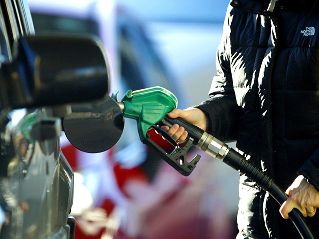
This infographic shows the price of a tank of petrol versus the average salary worldwide.
The data reveals both North America, the UK and Scandinavian countries fair the best when it comes to cost whereas regions including Afghanistan, Ethiopia and Egypt suffer from a small margin between income and petrol cost.
To find out how each country compares hover over the countries using your cursor below.
